Here you can find a handful of simple do’s and don’ts to help keep brand expressions consistent.
Logo
The Musopia logotype is a trademark of the Musopia brand. Our logo is made up of our “Ignition” symbol and the word mark.
Always respect the logo when creating layouts, and leave enough space around for it to breathe.
The exclusion zone of the logo is defined as in the adjacent example.
Additional Logo Versions
The horizontal version is preferred but a vertical version is available for situations where it’s the better choice.
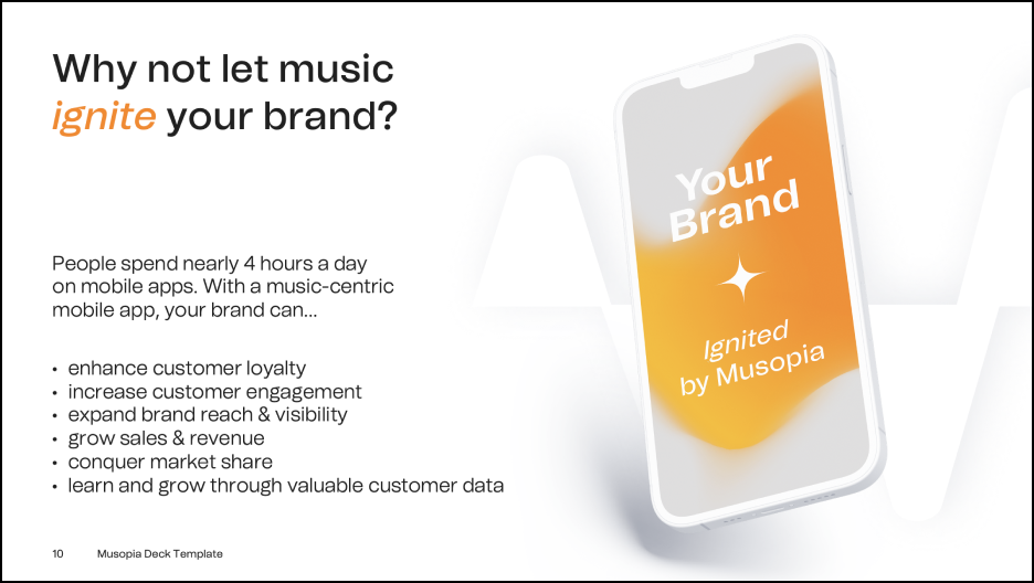
There is also an “Ignition version” that features the logo preceded by the phrase “Ignited by”. This version can be used for example in adverts or social media content that show a moment or emotion that has been made possible (‘ignited’) by Musopia. It can also be used on presentation cover pages, case studies, et cetera – anywhere where Musopia can proudly claim its role in having ‘ignited’ something.
A horizontal version of the “Ignition version” is included in the downloadable logo package. If a different layout of the “Ignite version” is needed for a particular use case, you are welcome to create one, but please take care of clarity and legibility.
Vertical version
Ignition version (horizontal, as found in the logo package)
Logo Usage
The adjacent examples show the use of the logo. The original files of the logo must always be used, and they must not be changed in any way. Remember to always ensure good legibility when using the logo.
Logo on a light image
Logo on a dark image
The logo must not be used over a tone with too little contrast.
“Ignite Orange” is the most dominant colour in all Musopia visuals. Additionally, purple and black can be used to support visual expression in different applications. Please avoid using lighter tones of Ignite Orange and Purple.
These secondary colours can be used to accentuate, highlight, or differentiate different communicative elements in certain situations. That said, please refrain from using too many of these too often, because it can result in messy visuals.
Musopia’s primary and headline usage font is Tomato Grotesk. It should be used whenever technically possible, and always in printed products, web applications and video presentations.
As a large amount of presentation material is produced in-house using Microsoft Office, a separate font has been chosen for these materials. The font to be used is Arial. This secondary font is to be used in correspondence, memos and PowerPoint as well, as in internet and e-mail messages.
Visual Language
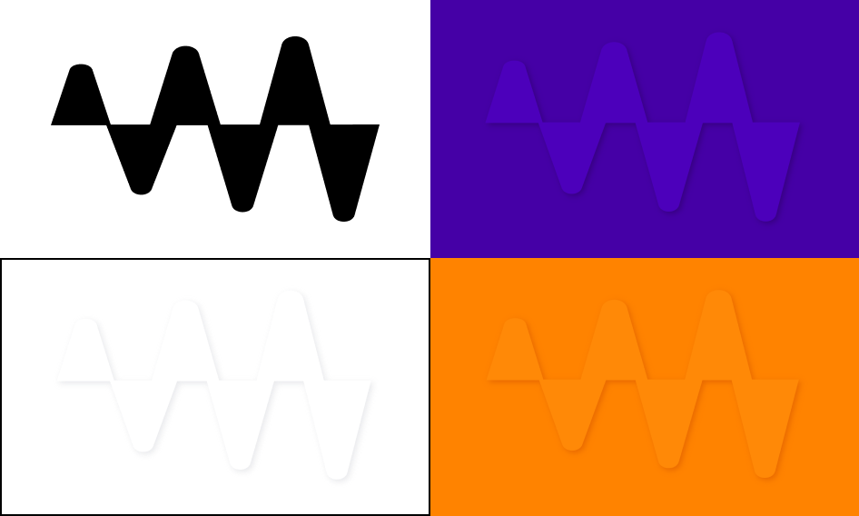
Musopia Soundwave
The Musopia Soundwave depicts the feeling of Musopian “ignition” and can be used in a variety of ways as an illustrative element.
In presentations, use the Musopia Soundwave element in the same color as the background to make the materials seem more alive.
Examples of using the Musopia Soundwave as a background element
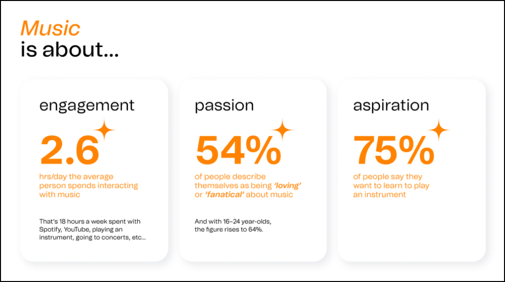
Floating cards in presentations and web content can contain text and numbers. As airiness and clarity is part of Musopia’s visual brand, the cards should always be used on a white background.
Examples of using floating cards
Imagery
Musopia brand imagery in a nutshell
Musopia’s brand level photography and videography express the joy of music and the moment of ignition where ordinary life gets enhanced, altered, and embellished by the magical power that only music provides. The main focus is always on people and their emotions, not on technicalities.
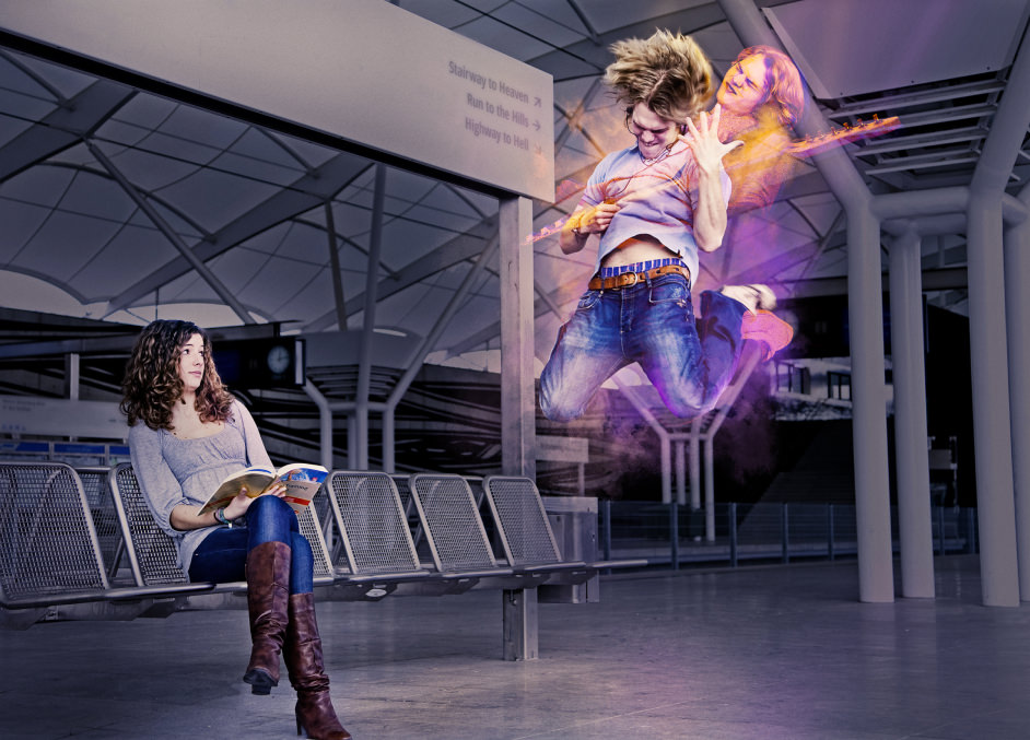
The Moment of Ignition
Using a combination of photographs, this type of imagery focuses on the idea of change. The Moment of Ignition is when individuals, groups, or situations suddenly leave their ordinary form behind and attain new perspectives, ignited by the magic of music.
The Joy of Music
This category of imagery presents the joy and freedom a person feels while they are playing a musical instrument. These images focus more on concrete musicianship and/or using Musopia applications: they are more realistic than the above-mentioned “Moment of Ignition” images which can be whimsical and even fantastical.
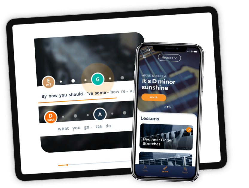
Product photography
Product photography presents the key product features in a clear and informative style, highlighting key elements in distinctive colors at the right time.